UI Case Study: Building Blocks Nursery website design revamp
Year: 2023
Duration: 5 days
Figma, Illustrator and Photoshop
Introduction
Building Blocks is a nursery school that is based in Ontario, Canada. The current website has all the information that is needed by the user, but the way information is organized can be improved. Besides, I set out to solve some UI design issues and make the design more appealing to the eye. Note that this is a personal project and it was conducted to test a design concept, it is not a real project that is based on communication.
Problem
The website has all the information the user needs but the information is organized in a way that makes it hard to find, this will result in quitting the website and going to other competitors. In addition, the website has some confusing design issues. In the next section, I will be discussing the current issues in detail.
Goal
The goal is to allow the user to reach the information they need in a faster way. This will ensure a fast and smooth process. The goal is also to eliminate all design issues and re-design the website to make it more visually appealing.
Design Process
1. Problem definition
I started my process by evaluating the current website layout and content to check for weak points and to decide on what should be improved.
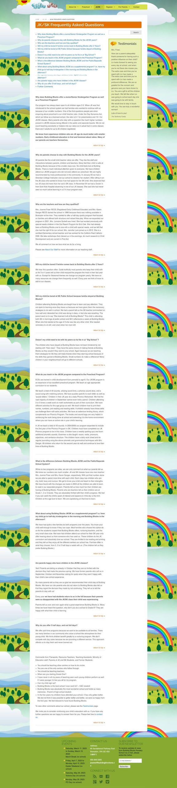
The website does not have a defined color palette, it has several different colors making it hard for the user to recognize the brand and remember it. In some areas, like in the banner section on the homepage, the text does not contrast well with the background making it hard to read.
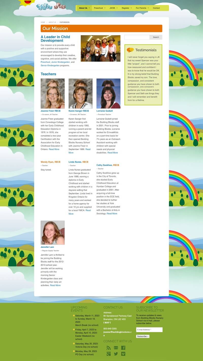
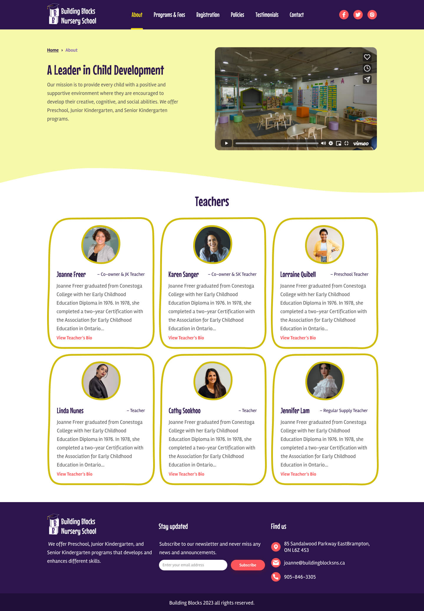
Images and staff photos that are used on the website are old. The important info section that is in the homepage is a mix of information and testimonials.
The footer does not align with the rest of the website content. On the about page, photos of the staff are not consistent, some of the staff have a photo and others do not.
Clicking on staff read more button shows a page not found error, which might be frustrating to parents who want to know more about their child’s teacher.
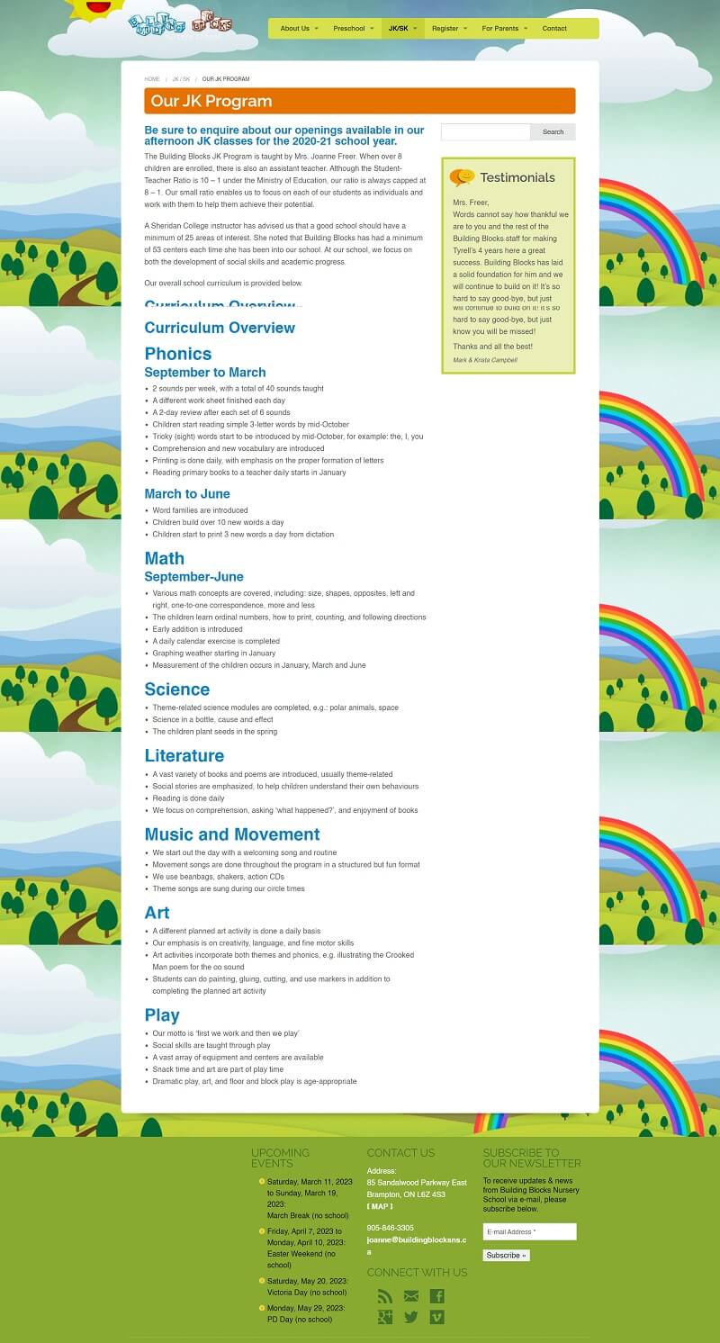
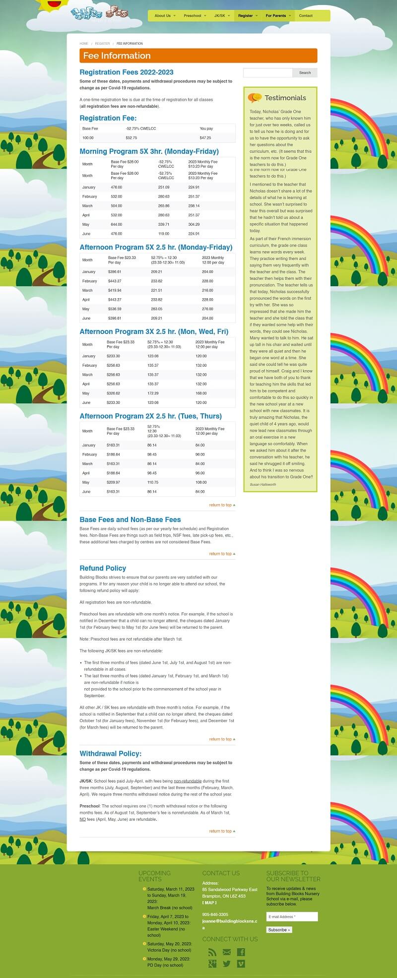
The registration page contains different PDF files which are more time-consuming for the users to fill out.
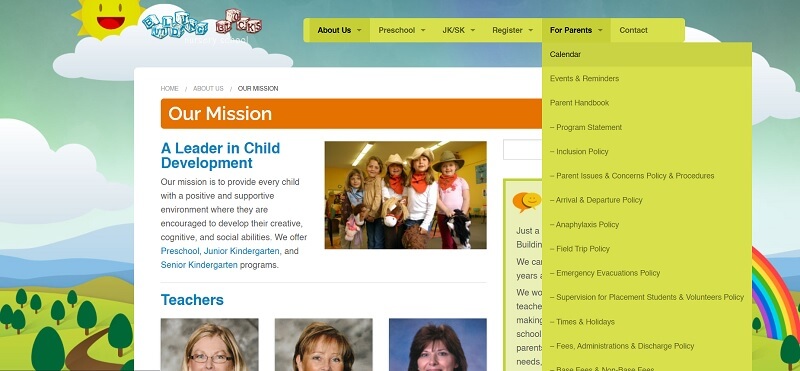
The sub-menu for the “For Parents” tab extends too much, more than the length of the page, making it hard to reach the lower sub-tabs, which can be resolved by simply adding a scroll bar to the sub-menu.
2. Research
I checked the competitors and analyzed the current state of their websites and checked their strong and weak points. Thereafter, I identified the changes I want to make to the website that is expected to improve it and I identified the best practices to organize information.
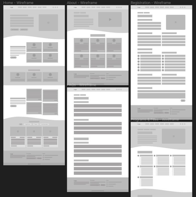
3. Wireframes
After deciding about the features, pages, site map, and information the website should have, I started by creating low-fidelity wireframes to roughly visualize the new look of the website.
The website will consist of 8 main pages in total; homepage, about, programs & fees, registration, policies, testimonials, FAQs and contact us page. The website will also include sub-pages; a page for each staff bio, and a page for each program.
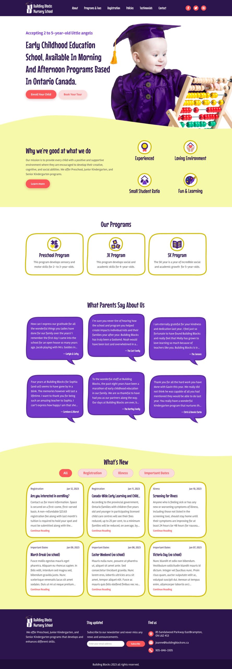
The homepage should feature the important sections of the website, such as the available programs, testimonials and latest news.
4. Brand adjective
After completing the wireframes and before moving into the hi-fidelity design I set a brand definition. Since it is a nursery, I wanted it to feel playful and friendly so I chose design assets, typefaces, icons, images, and color palettes accordingly. This process also included creating a UI kit to stay consistent with the design.
Typefaces
Mouse Memoirs & Rambla
Color palette
#2C154C
#7237C5
#FB565A
#CFBC0D
#F1DC1B
#F6F9A9
5. Logo design
The existing logo is nice but outdated and does not fit the new website identity. I am not a logo designer but I tried to come up with something that matches the new brand adjective.
6. Hi-fidelity design
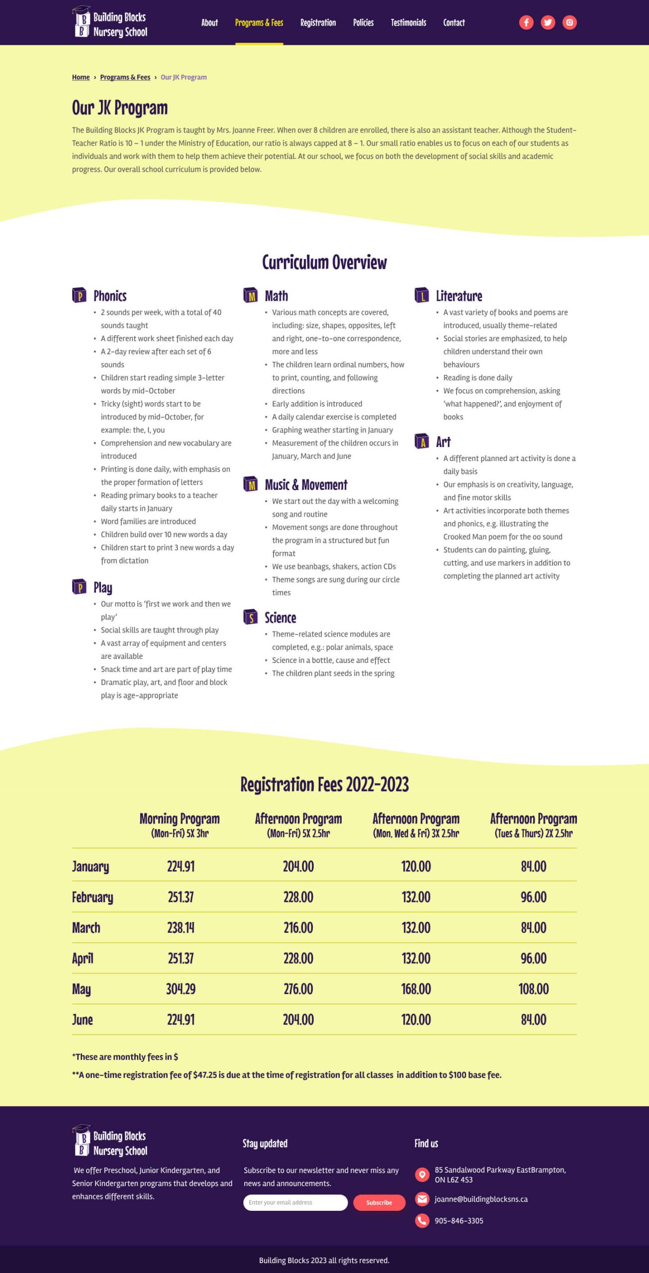
The homepage now highlights the important sections of the website, the programs and details about the school are listed. I added a testimonial section to the homepage instead of the testimonials being added to the side of each page on the current website. I also added a section for the latest news with tabs to filter the news based on the topic. On the about page, I added stock photos for each teacher because the current photos are old, and these are to be replaced with new real photos. I designed a page for each program that includes all of its details, curriculum and fees instead of having two separate pages for the program and fees as on the current website.
.
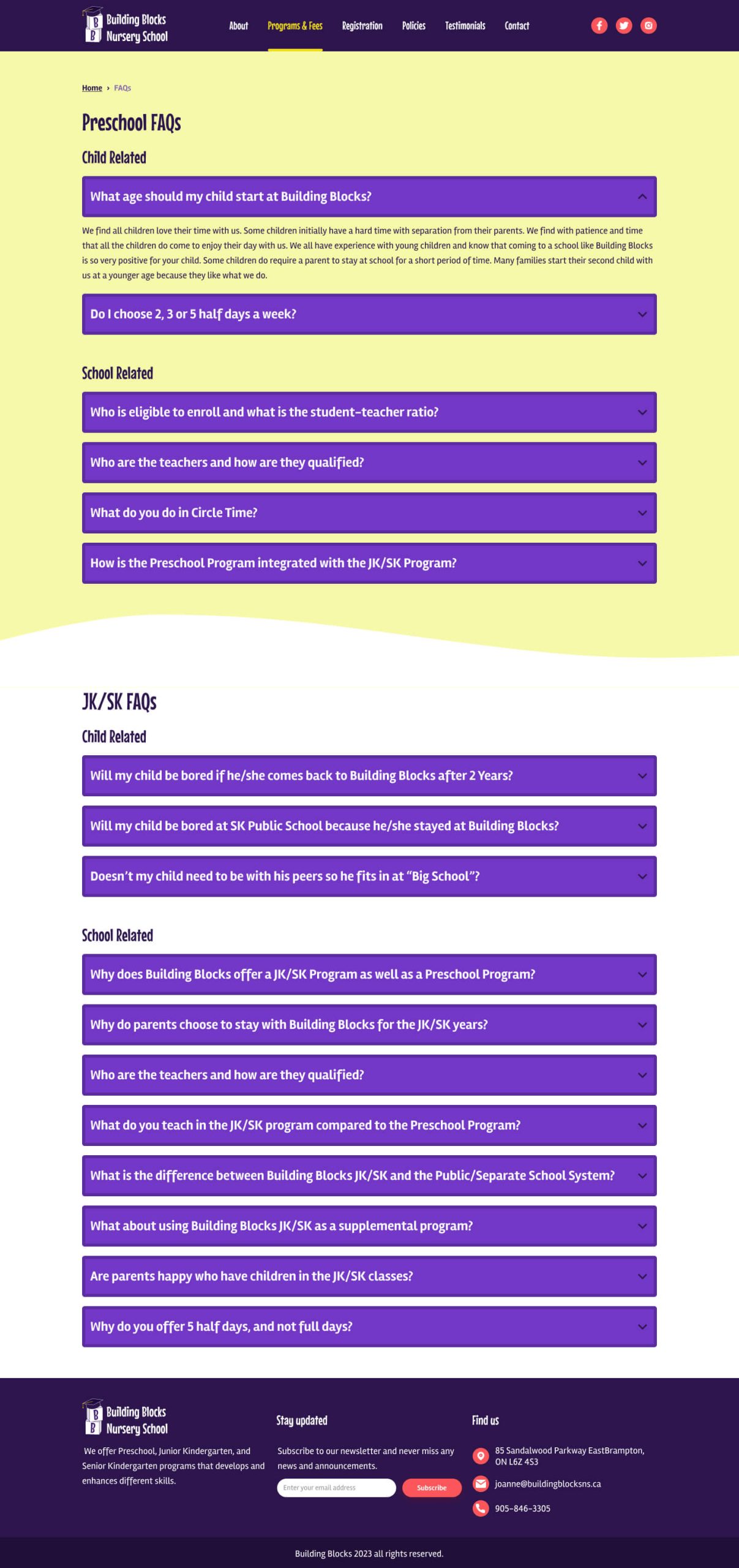
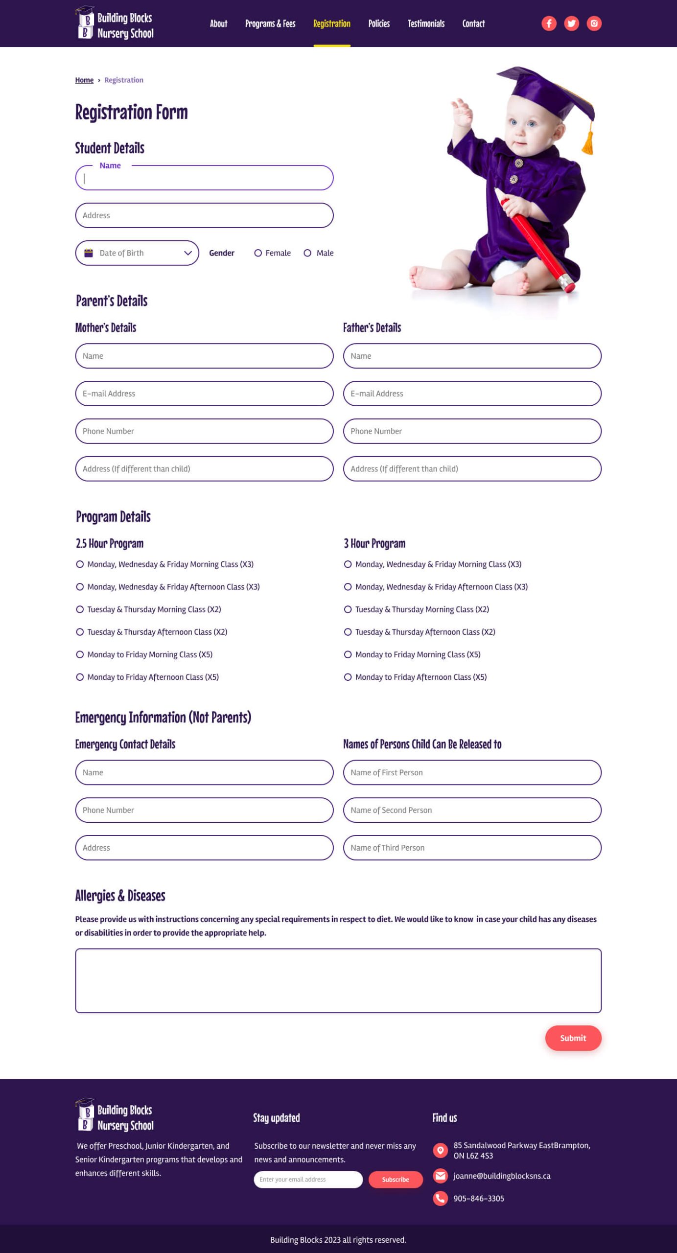
For registration, I designed a form that requires the necessary information for a child’s registration that is divided into multiple sections so that the user does not feel overwhelmed to fill out one big form. I created a FAQs page using accordion. Questions are divided based on the program and for each program, questions are further divided into two groups; child-related and school-related so that it is easier for the user to navigate to a question they seek an answer to.
Conclusion and next steps
In this design project, I revamped Building Blocks Nursery website and fixed the design issues that are in the current website. In the next step, I would like to implement a prototype and validate my design.