UI Case Study: Royal Medical Center website design revamp
Year: 2022
Duration: 10 days
Figma, Illustrator and Photoshop
Introduction
Royal medical center is a multidisciplinary medical center that is based in Qatar. The current website is missing some important information to the user and has some design issues that I am set out to solve. Note that this is a personal project and it was conducted to test a design concept, it is not a real project that is based on communication.
Problem
The website is missing some important information to the user that will either cause a delay in their treatment process or will result in quitting the website and going to other competitors. In addition, the website has some design issues that are confusing. In the next section, I will be discussing the current issues in detail.
Goal
The goal is to provide the user with all the information they need about the medical center, doctors and insurance providers. This will ensure a fast process for the patient and they can directly book their appointment with no delay. The goal is also to eliminate all design issues and re-design the website to make it more visually appealing.
Design Process
1. Problem definition
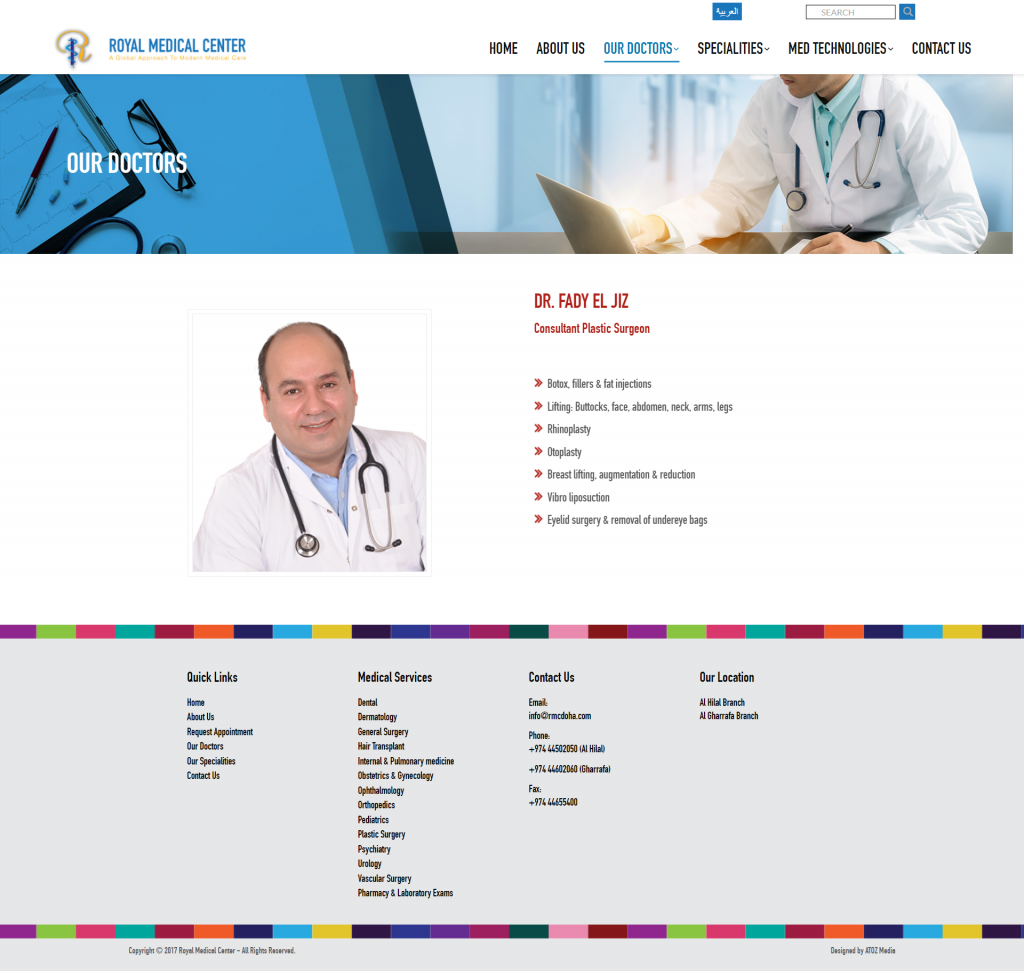
I started my process by evaluating the current website layout and content to check for the weak points and to decide on what should be improved.
The website does not have a defined color palette, it has several different colors making it hard for the user to recognize the brand and remember it. In some areas, like in the “our doctors” section on the homepage, the text does not contrast well with the background making it hard to read.
The stock images used in the website are a bit unrealistic and the user cannot relate to them. They consist of people that are foreign to the community and with strong facial expressions looking directly into the user.
On the request appointment web page, the user can enter their name, e-mail, phone, subject, and message. The user cannot select a certain clinic or doctor or date from the form and this causes a delay in the service.
Contact us web page consists of 3 closed tabs that require an extra effort from the user to open them and check the details which I do not think is a good idea.
The only way for the user to request an appointment is through clicking the button on the homepage, I think it would be better if it is also added to the navbar.
Clinics, doctors and med-technologies can be organized in a more efficient way to make it easier for the user to navigate.
2. Research
I checked the competitors and analyzed the current state of their websites and checked their strong and weak points. Thereafter, I identified the changes I want to make to the website that is expected to improve it and I identified the best practices to organize information.
3. Wireframes
After deciding about the features, pages, site map, and information the website should have, I started by creating low-fidelity wireframes to roughly visualize the new look of the website.
The website will consist of 6 main pages in total; homepage, about us, clinics page, doctors page, appointments page and contact us page. The website will also include sub-pages; a page for each clinic, and a page for each doctor.
The homepage should feature the important sections of the website, such as the available clinics in the medical center, a list of the doctors and insurance providers that the medical center deals with.
4. Brand adjective
After completing the wireframes and before moving into hi-fidelity design I sat a brand definition. Since it is a medical center, I wanted it to feel trustworthy so I chose design assets, typefaces, icons, images, and color palettes based on this. This process also included creating a UI kit to stay consistent with the design.
Typeface
Open Sans
Color palette
#09303D
#105167
#1C91B9
#BAD1DA
#D2ECF5
#F2FAFD
5. Logo design
The existing logo is really nice but the shadow on the icon gives it an outdated feeling. I am not a logo designer but I tried to come up with something that matches the new brand adjective.

6. Hi-fidelity design
The homepage now has a stock image that the patient can relate to and represents the society they are from. The homepage highlights the important sections of the website such as the available clinics, a list of doctors and insurance providers. On the doctors page, the user can view the available doctors and can use the filter to look for doctors based on clinics. Moreover, the user can read more about the doctor or directly book an appointment. Clicking to know more about a doctor will open a new page that has all the details about the doctor including languages they speak, the branch they work in, their working hours, and a button to book an appointment with the doctor.
.
The clinics page has a list of all of the available clinics in the medical center, clicking on a clinic will take the user to the details page of that clinic. The details page includes details about the clinic, services provided, medical technologies used, and lists the specialized doctors for this clinic.
The appointment booking form is divided into two stages so that the user does not find it bulky and overwhelming. The first part of the form includes personal information such as name, phone number, and e-mail. The second part includes appointment details, the user has to select a clinic, doctor, date and time and leave an optional message in case they have any notes.
Conclusion and next steps
In this design project I revamped Royal Medical Center website and fixed the design issues that are in the current website. In the next step I would like to implement a prototype and validate my design.


